Make the Numbers Pretty!
Design Experience
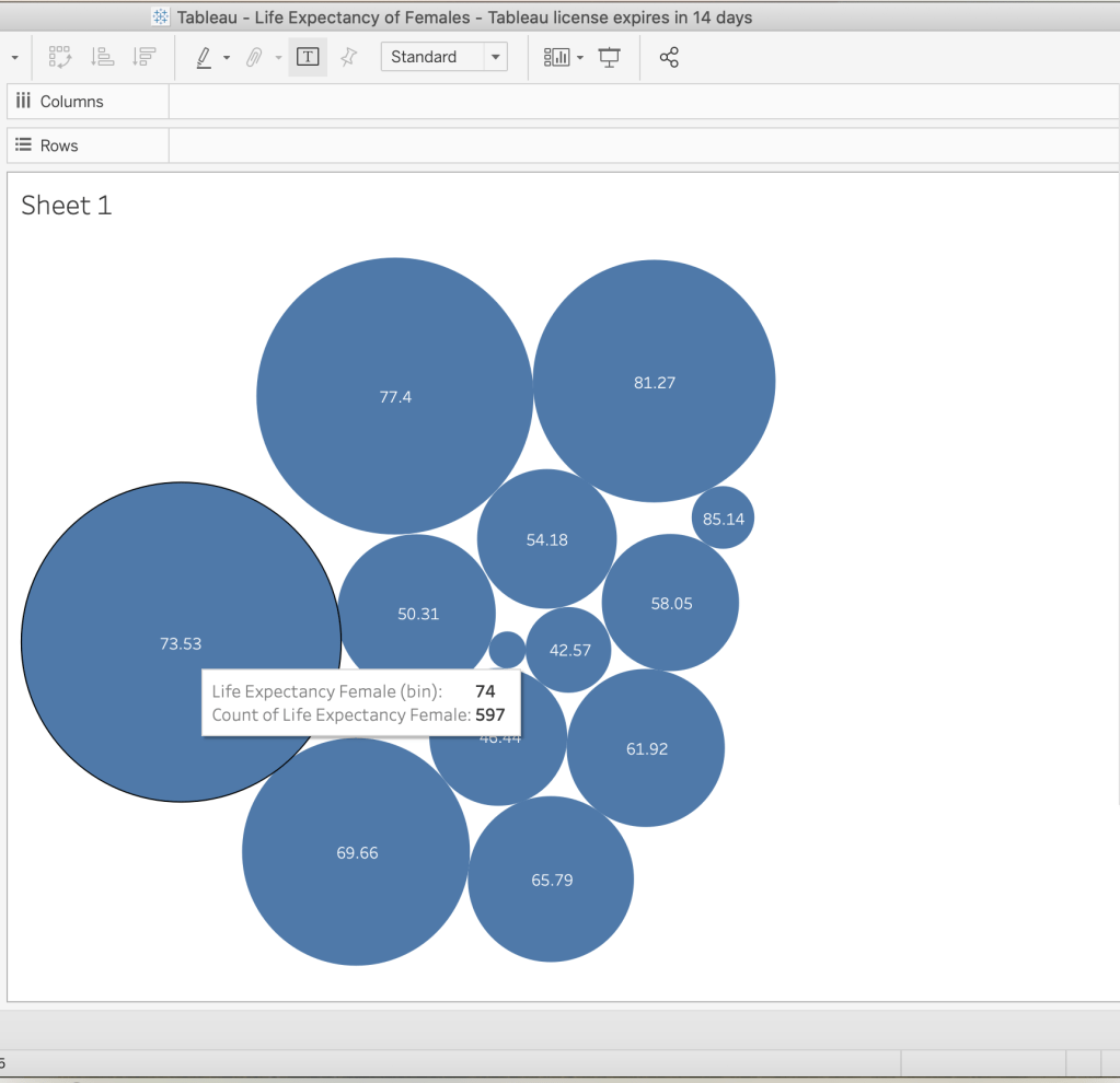
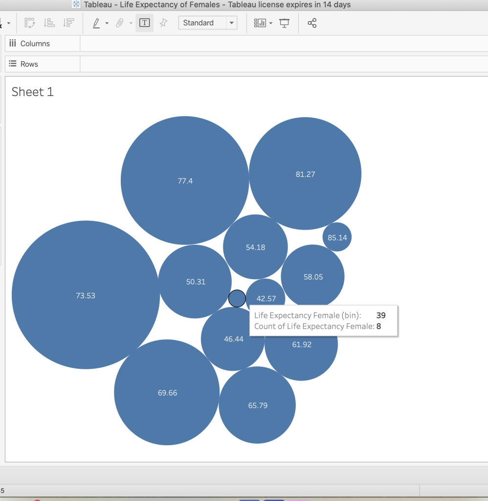
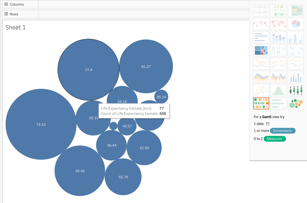
For this project I decided to use the program Tableau which is a professional data visualization app. The app allows you incorporate data from various sources including Excel. Initially I attempted to use Excel as my data source based on New York City’s Covid daily positive rates measured at every 7 and 28 days. However that data was a bit sparse and didn’t make for an interesting visualization. So I decided to use one the data sets that Tableau provides. Within that table I decided to focus on health indicators and within health indicators I focused on life expectancy of females which I filtered out in the program simply by using the filter button in the right hand corner. I went into the sheets and determined how I wanted my data to be visualized. I chose the packed bubbles view which presented itself as shown in the image above. When you hover over each of bubbles more details about the data appear and the bubbles are visually sized by values they are associated with.
Take a look Behind the Scenes

Data Visualization Proposal
Title: Make the Numbers Pretty
Concept Overview: This a data visualization of female life expectation globally.
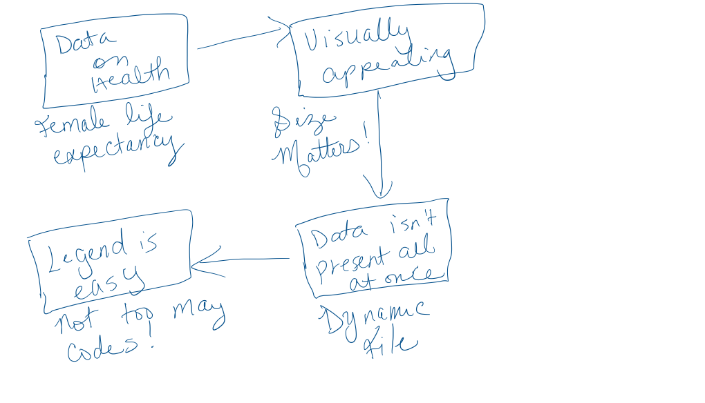
Statement of Need: Female life expectancy is an important indicator of a country’s health because females in a lot of cases are caregivers in their communities. As a result evidence of a long female life expectancy also correlates to overall health of the country. This data is important to begin to start to understand and analyze that information. Presenting the data in a visually appealing way reduces cognitive load allows the user to navigate the information at their own pace.
Concept Description: The data is visualized by creating circles that corresponds to the life expectancy value of females in each bubble. So, countries with longer female life expectancy has bubbles that appear larger and countries with shorter female life expectancy has bubbles that appear smaller. I also chose to have all the bubbles the same color so the user doesn’t have to determine which color corresponds to which data point, which would add to their cognitive load as it would be additional information to process. When the user hovers over the bubble additional information about the data is presented which makes it easier to learn the information as the data graphics doesn’t bombard the user with all of the data in one view.
Target audience: Everyone who is interested in female life expectancies or the correlation between female life expectancy and the health of a country.
Learning Goals:
- Users will learn how long females live in various countries
- Users will learn to navigate the data visualization chart
- User’s will be able to tell which countries have a healthier health index based on the life expectancy of females within the country.
Learning Theories:
- Cognitive Load Theory (Sweller, 1988): Since information is presented that highlights the main points and color codes the information people will not be overwhelmed and will know the main take away for them to remember.
References
Sweller, J. (1988). Cognitive load during problem solving: Effects on learning. Cognitive Science, 12, 257–285.
